A Soviet Devil in the Capitalist Details
tags: Communism,Phillip W. Magness,Thomas Piketty
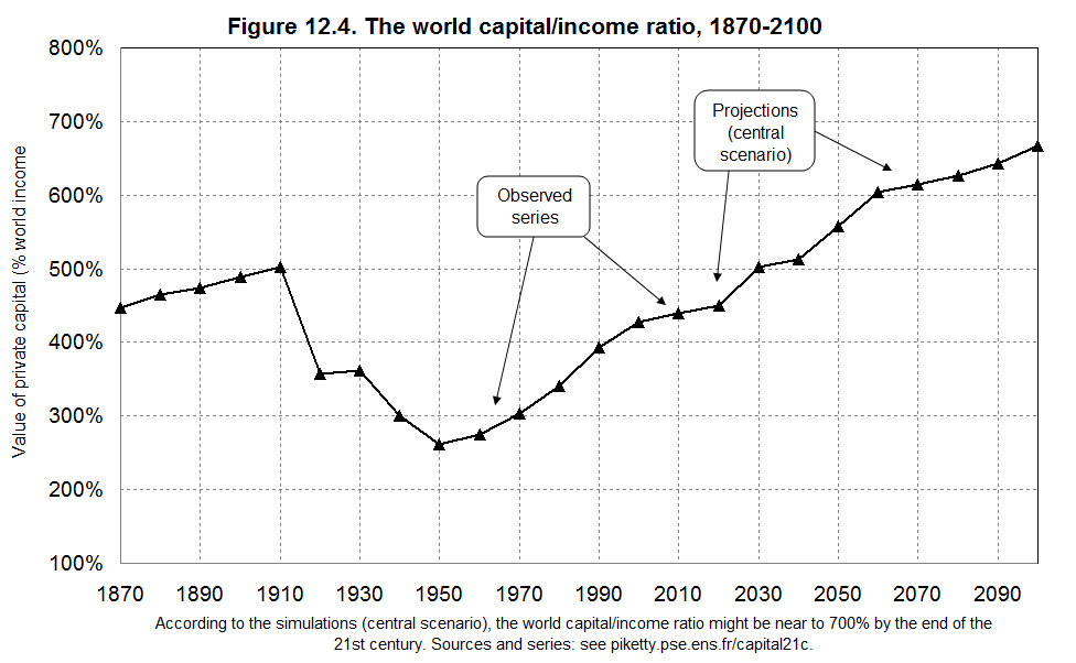
The other day I began scrutinizing Thomas Piketty’s data on capital to national income ratios and particularly the twice-published Figure 5.8/12.4. This graph provides an important piece of evidence for Piketty’s theoretical argument in Capital in the 21st Century, and particularly his contention that “a country that saves a lot and grows slowly will over the long run accumulate an enormous stock of capital (relative to its income), which can in turn have a significant effect on the social structure and distribution of wealth.” This “law” of capital accumulation, along with Piketty’s much quoted formula r>g, is supposed to demonstrate the central argument of his book wherein returns on capital outpace income, leading to sustained wealth disparity.
Drawing on the data in Figure 5.8 and forecasted trends from it into the 21st century, Piketty quite clearly articulates its meaning: the graph is supposed to illustrate that the world is on a direct path to Gilded Age levels of capital accumulation and thus perpetually growing wealth disparity. Or as he notes, the graph
“implies that the global capital/income ratio will quite logically continue to rise and could approach 700 percent before the end of the twenty first century, or approximately the level observed in Europe from the eighteenth century to the Belle Époque. In other words, by 2100, the entire planet could look like Europe at the turn of the twentieth century, at least in terms of capital intensity.”
This is a stunning claim, and one supposedly demonstrated in the “U-shaped” curve of Figure 5.8/12.4. Or so it might seem…
Now I mentioned the other day that (in addition to insufficient and erroneous annotation) there were two underlying problems with the source data that Piketty uses to compile this graph. First, he seems to be missing quite a bit of data for his regional capital/income ratios and simply filled them in by some very rough guesstimation. Second, he has even larger gaps in his regional output data which he uses to weight his already patchy capital/income ratios. These gaps include the entire period from 1913 to 1950 and require him to assume a stable ratio across all regions during this period – an assumption that appears extremely tenuous given what happened between 1913 and 1950.
I’ll return to these problems momentarily as they both interact with a third and potentially more glaring problem: Piketty’s handling of his estimates for the Soviet Union and other communist states in the mid 20th century entails some highly questionable assumptions and is almost certainly accentuating the bottom of the “U-shape” in Figure 5.8.
Let’s return to Piketty’s source data from excel table TS12.4. The cells where he used rough estimations in lieu of data are highlighted in pink. Recall that Piketty was somewhat less than forthright in describing what he did here. He states that “For the period 1870–1990 there are no truly reliable estimates, and I have simply assumed that the overall level was about the same” (emphasis added). Pay close attention to the cells that are highlighted in the darker red though, and we immediately see that the overall levels are not in fact assumed or kept at “about the same” for these countries.

Rather, what we see here is Piketty changing the capital/national income ratios for Eastern Europe, Russia (the Soviet Union), and China during the years that they were under communist control to a baseline parity with income. The Russian column thus shows a ratio of only 100% from 1920-1990, reflecting the duration of the Soviet Union. The Eastern Bloc and China similarly show the same 100% from 1950-1990, reflecting the Iron Curtain era and Mao’s 1949 Revolution until roughly the fall of the Berlin Wall and the increasing liberalization of the modern Chinese economy since the 1990s.
Presumably this all has something to do with the supposed abolition of private capital ownership in communist states. But really? Is this apparent relic of an ideologically tinged claim of communist paper-pushing really a valid assumption to make for purposes of data analysis? And should we even be including the mid 20th century’s communist regimes in a data set that was supposedly constructed to better understand the operation of capital in open market economies? On both counts, Piketty seems to have made a seriously questionable call of judgment.
Turning to the effects of the communist era intrusions upon Piketty’s trend line, a couple caveats are in order. First as noted, Piketty’s regional data is weighted in compiling the overall global ratio (and I would argue improperly so due to the large aforementioned gaps in his regional output data). Second, since most of his data outside of Western Europe and North America is guesstimated (i.e. simply made up), it is at most a very rough and unreliable approximation. Nonetheless Piketty does include it, and in doing so he also somewhat understates its effect upon his cumulative global capital/income ratio estimate.
That duly noted, we may plainly see that his inclusion of the three communist regions, along with an assumption of a comparatively low 100% ratio in each, exerts a downward pull upon the global ratio at the mid 20th century:
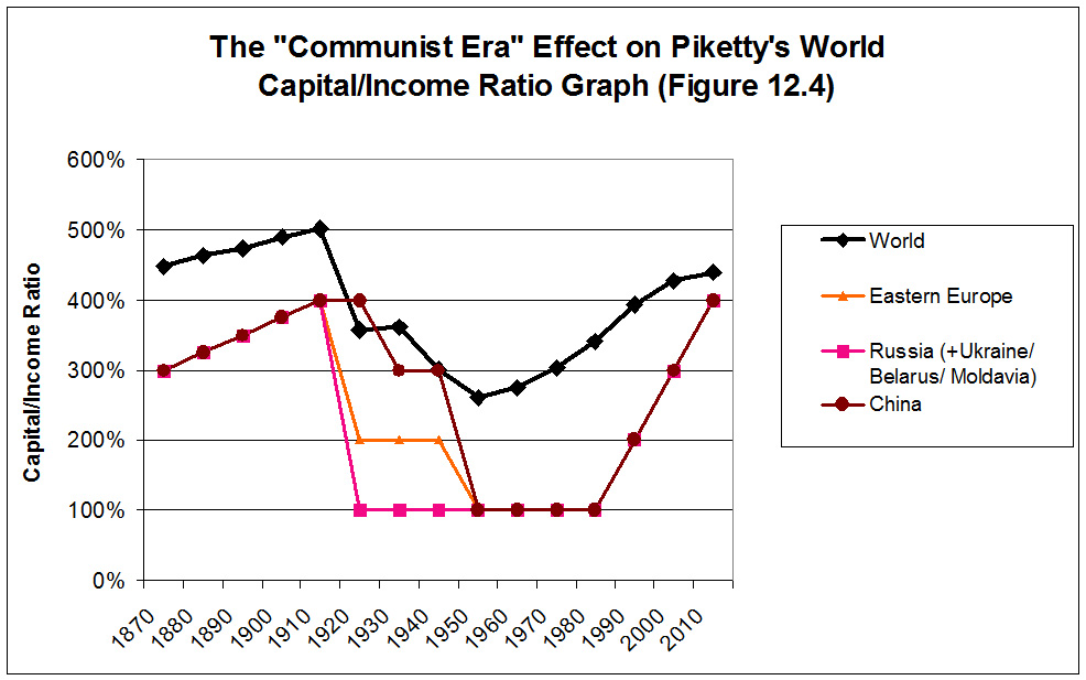
It is somewhat more difficult to tease out exactly how strong this pull is over time due to the aforementioned problems and multi-decade gaps in Piketty’s weighting scheme. But taking his weights as a given for the moment, we may find a point of comparison at the trough on the global ratio in 1950.
Piketty’s regional output weights for 1950 break down as follows, along with their capital/income ratios (percentages are rounded for simplification):
| Region | Output % | C/I Ratio |
| North America | 29% | 356% |
| Western Europe | 27% | 232% |
| Communist Bloc | 17% | 100% |
| Latin America | 8% | 300% |
| Rest of World | 19% | 300% |
| Global |
100% | 261% |
Note that Western Europe’s ratio is estimated just below the global estimate. The assumed numbers for Latin America and the rest of the world are slightly above it. And North America is almost 100 percentage points higher than the global ratio. The clearest downward pull then – weighted at a not-insubstantial 17% of global output – comes from the communist world where Piketty has assumed a drastically lower ratio. The strange and tenuous assumptions he makes by including the mid 20th century’s communist economies accordingly seem to be accentuating the 1950s trough on Figure 5.8/12.4 and giving Piketty the clear “U-shape” that his theory anticipates and that his historical narrative expects to find.

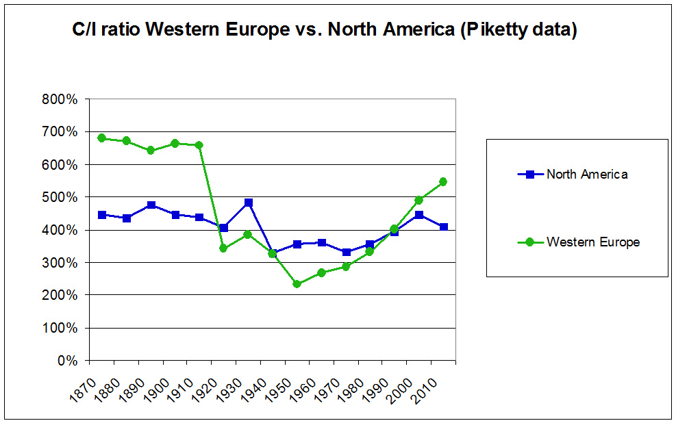
It should be noted in full fairness that the ratio for Western Europe when taken alone is similarly U-shaped, though the most pronounced drop-off that creates this U takes place in a single decade and is entirely attributable to the destructiveness of the First World War. The North American ratio is in stark contrast though, being both substantially flatter over the 20th century and seeming to fluctuate only slightly to either side of a relatively stable 400% across the past century.
The largest fluctuation by far though is that created by the communist world in the mid 20th century. This suggests that if Piketty’s theory and data are even plausibly accurate representations of reality, he should be prepared to admit that the data point he seems to consider preferable to the present day is also one that captures and incorporates the claimed capital ownership and wealth-equalizing effects of the mid-century high water mark of Stalinist and Maoist barbarism.